Another ethical seal is coming. Another symbol…. another promise.
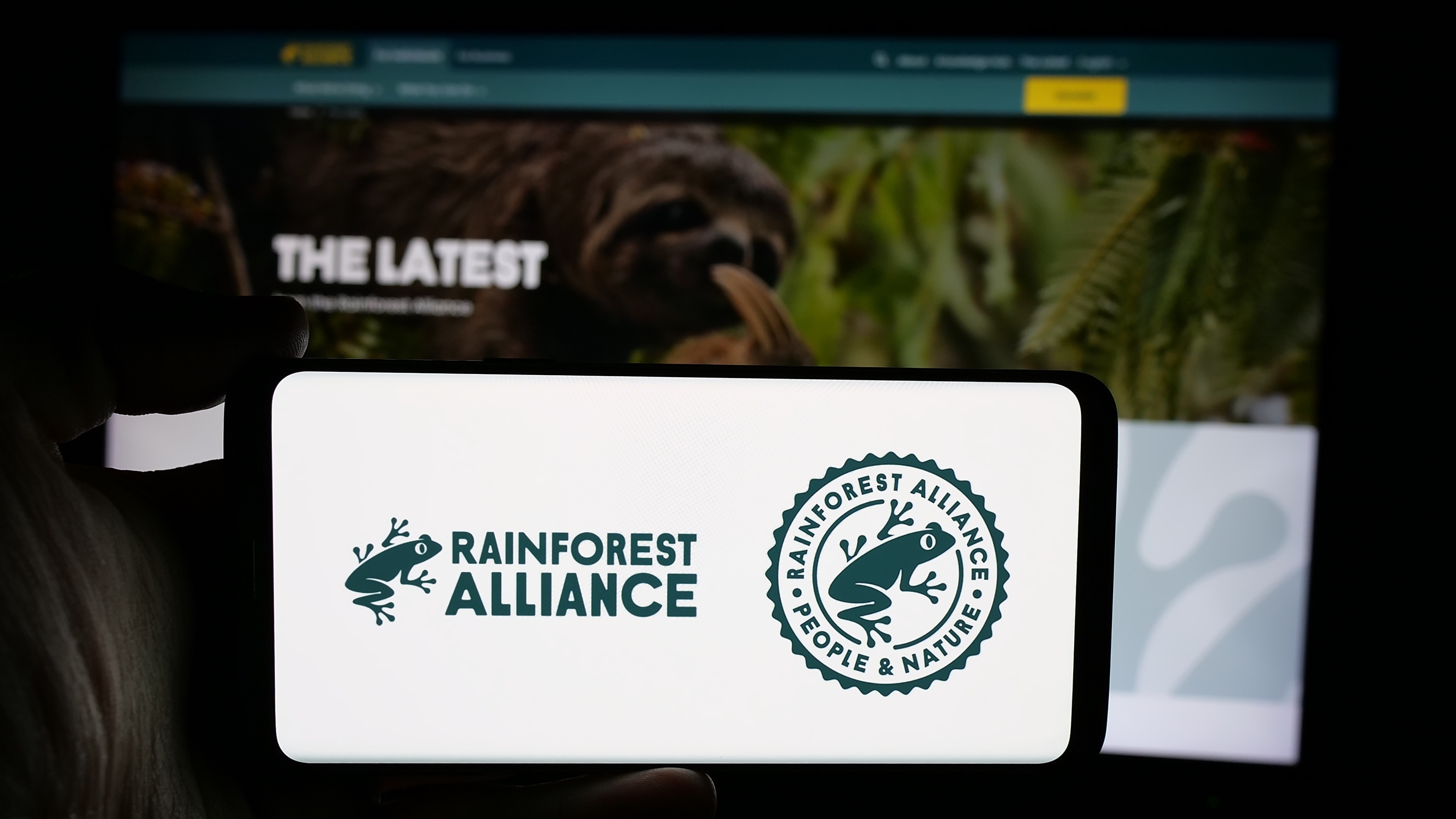
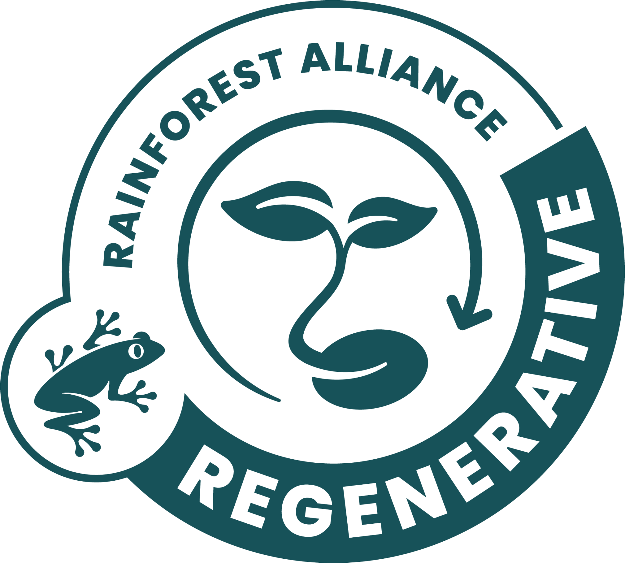
This time it’s from the Rainforest Alliance. And yes, the little green frog is back, the same, red-eyed tree frog that’s been reassuring shoppers for decades. But before brands rush to place yet another eco-badge on pack, it’s worth asking a very simple question:
Do people need another seal? Instead, do they need a better way to understand the ones already in front of them?
Because most consumers aren’t wandering supermarket aisles searching for sustainability Sudoku. They want clarity, quickly and confidently. And without having to wade through an essay on soil health.
And in our four decades designing packaging for major retailers and brands, we’ve seen how easily good intentions can get lost when too many symbols compete for the same few seconds of shopper attention.
Rainforest Alliance: A Brief History (and Why the Frog Matters)
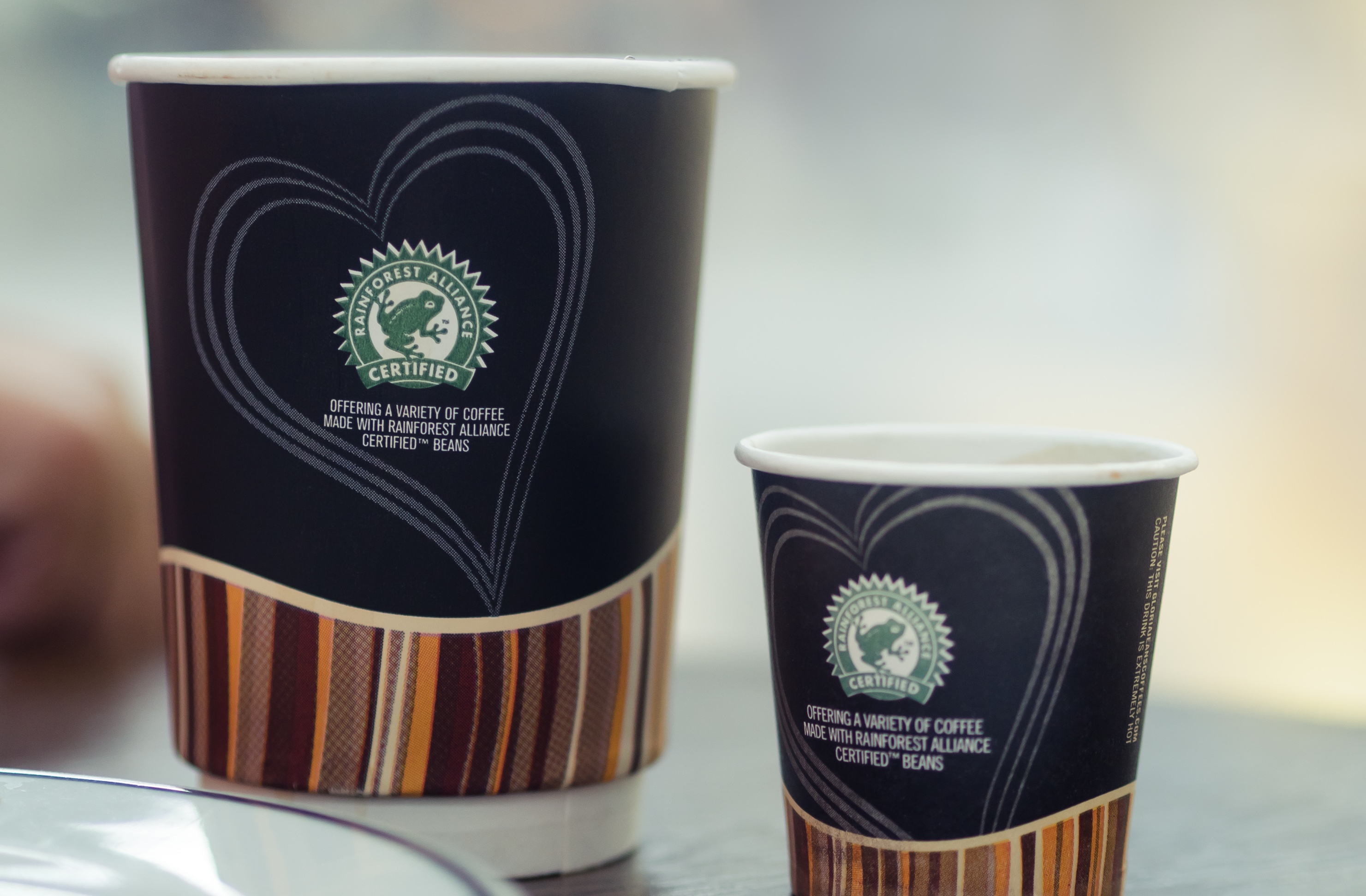
Rainforest Alliance isn’t new to this game. Founded in 1987 with a mission to protect forests, support farmers and challenge exploitation through market influence, the organisation built its identity around a simple but powerful symbol: the green frog. Chosen because frogs are natural bio-indicators, thriving only in healthy, balanced ecosystems, the red-eyed tree frog became a global shorthand for biodiversity, forest protection and responsible agriculture.
Introduced in the 1990s, the seal quickly became one of the most recognisable ethical badges on supermarket shelves, particularly across coffee, cocoa, bananas and tea.
As sustainability expectations evolved, so did the seal.
· The original Green Frog Seal signified that products came from Rainforest Alliance Certified farms.
· The 2020 updated seal, launched after the organisation’s merger with UTZ, offered a more modern and unified symbol of environmental protection and social responsibility.
Throughout each redesign, the frog endured because it communicates something clear and intuitive: “This product is connected to a healthier planet.” Over time, it has become more than a certification mark, almost a brand in its own right.
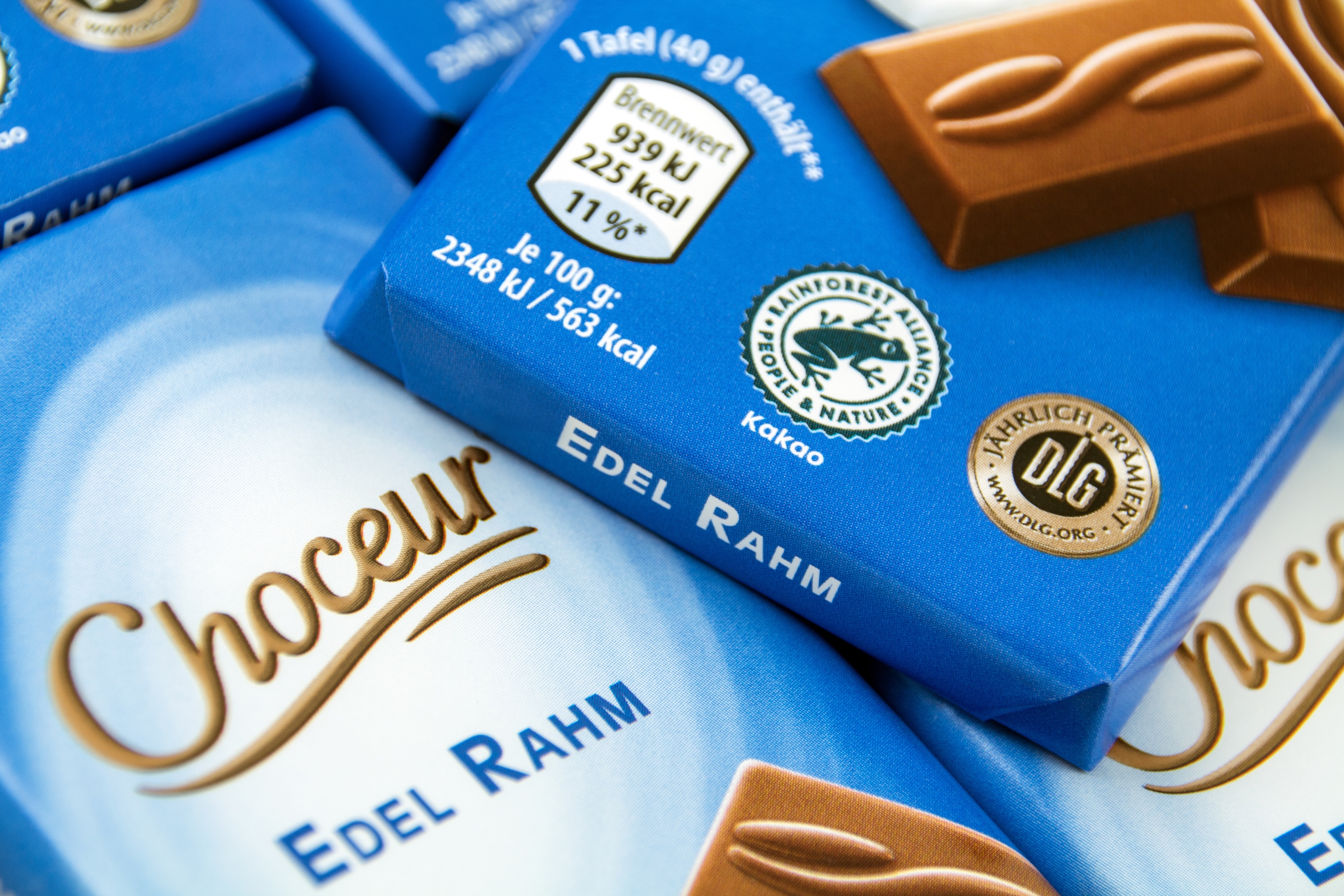
Today, the frog appears on packs from widely recognised brands such as KitKat, Magnum, Carte D’Or, Kenco and Dr Oetker, helping consumers connect everyday purchases with sustainable sourcing.
And now, in early 2026, a new regenerative agriculture seal is set to join the family. It also raises an important question about how many symbols consumers can meaningfully process.
But every new seal, no matter how well-intentioned, still has to work on pack, in a space already under pressure from nutritional systems, recycling labels, retailer marks and mandatory claims. That’s where the real challenge begins.
Raising the Standard Is Good. Raising Confusion Isn’t.
The Rainforest Alliance’s new Regenerative Agriculture Certification represents a genuine step forward: higher thresholds, increased biodiversity requirements, more diverse shade tree species, stronger soil-health criteria and more rigorous audits.
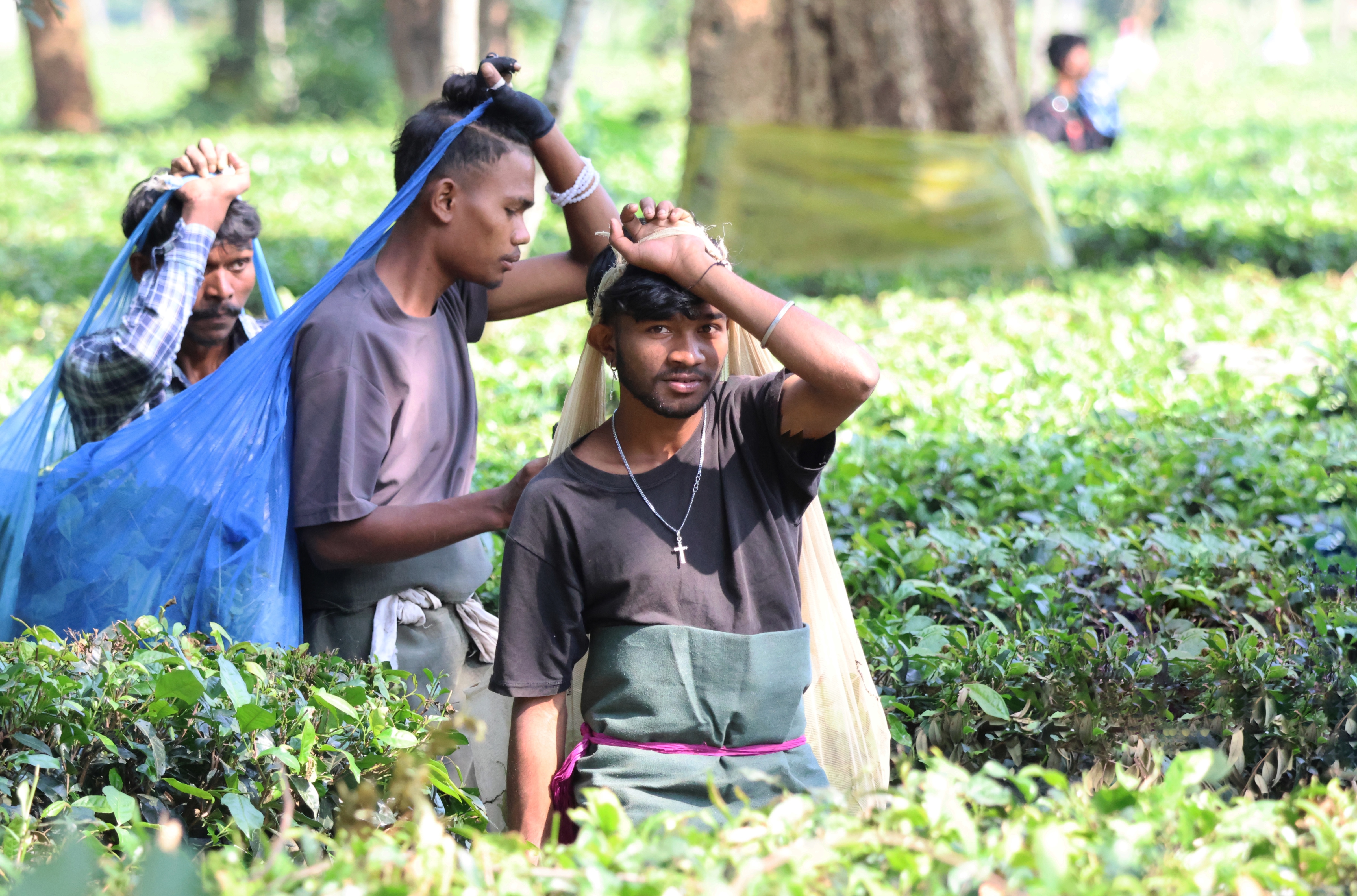
There is growing interest across sectors such as cocoa and coffee, although adoption remains uneven, reflecting wider industry uncertainty over which certifications offer the most value or impact.
Nespresso has already signed on, describing it as “a natural next step” of its long-standing sustainability work.
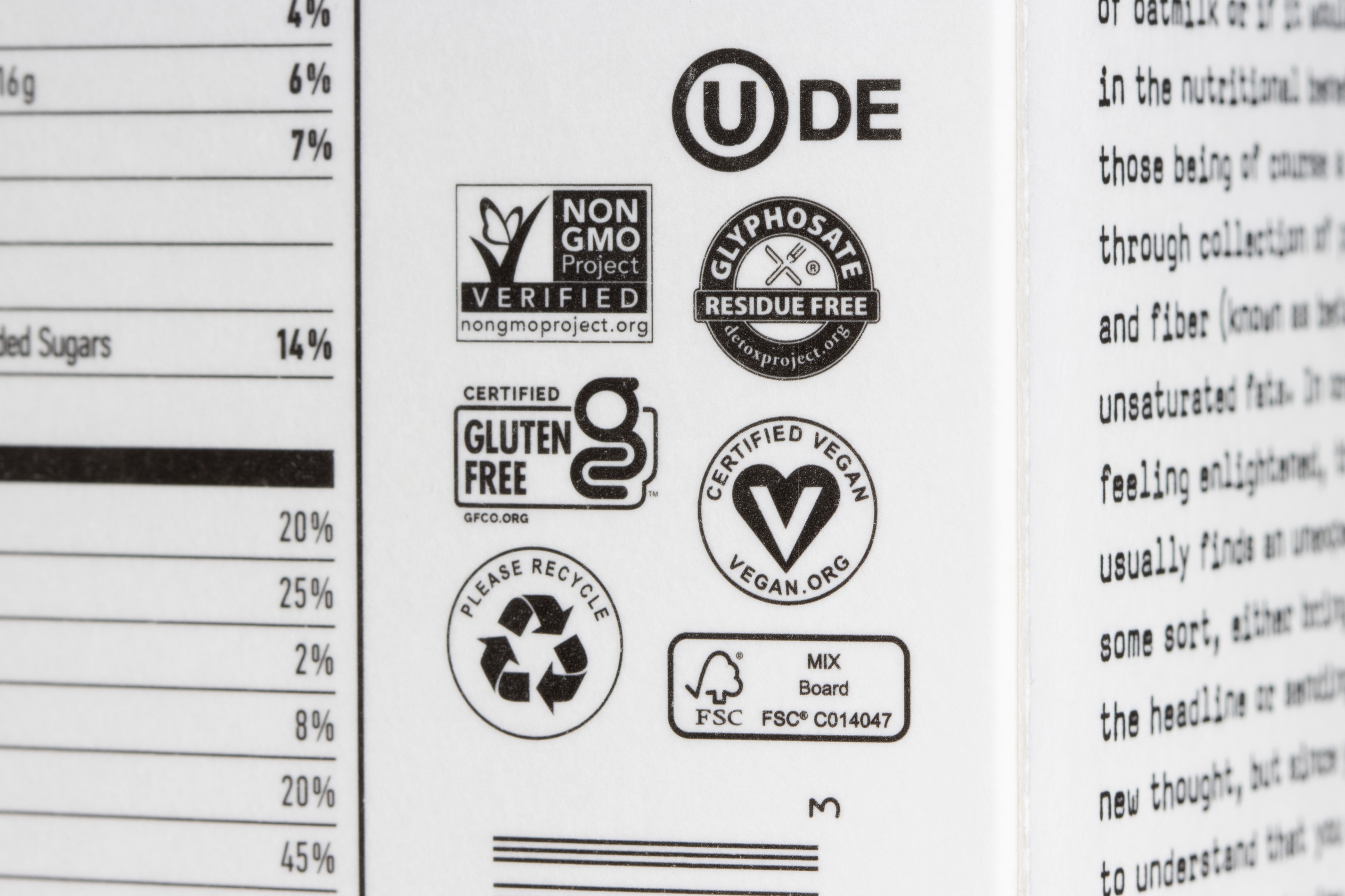
But this development lands in a landscape already crowded with certifications, more than 450 by some counts. On shelf, that translates to visual noise, a wall of competing icons asking the shopper to decode sustainability in seconds. Most won’t. They’ll scan, choose, and move on.
In that context, the new frog seal solves a real agricultural challenge, but it creates a communication one.
And this comes at a time when Rainforest Alliance has actually seen a decline in certified SKUs globally in recent years, highlighting how competitive and fragmented the certification landscape has become.
Fairtrade Proves It: People Don’t Buy Logos. They Buy Meaning.
While Rainforest Alliance launches a new badge, Fairtrade is enjoying a revival.
Its recent campaign drove a 40% increase in certified tea sales, major retailers have reintroduced the Fairtrade mark after long absences, and multiple brands have publicly committed to stronger fair-sourcing practices.
This resurgence isn’t the result of a redesigned logo or a refreshed graphic. It’s because the story behind Fairtrade managed to genuinely connect with people. In fact, during Fairtrade Fortnight, communities across the UK organised grassroots activity to highlight the human and environmental cost behind everyday tea, including in Cornwall, where local volunteers decorated the town with hand-knitted teapots, mugs and “yarn-bombed” displays.
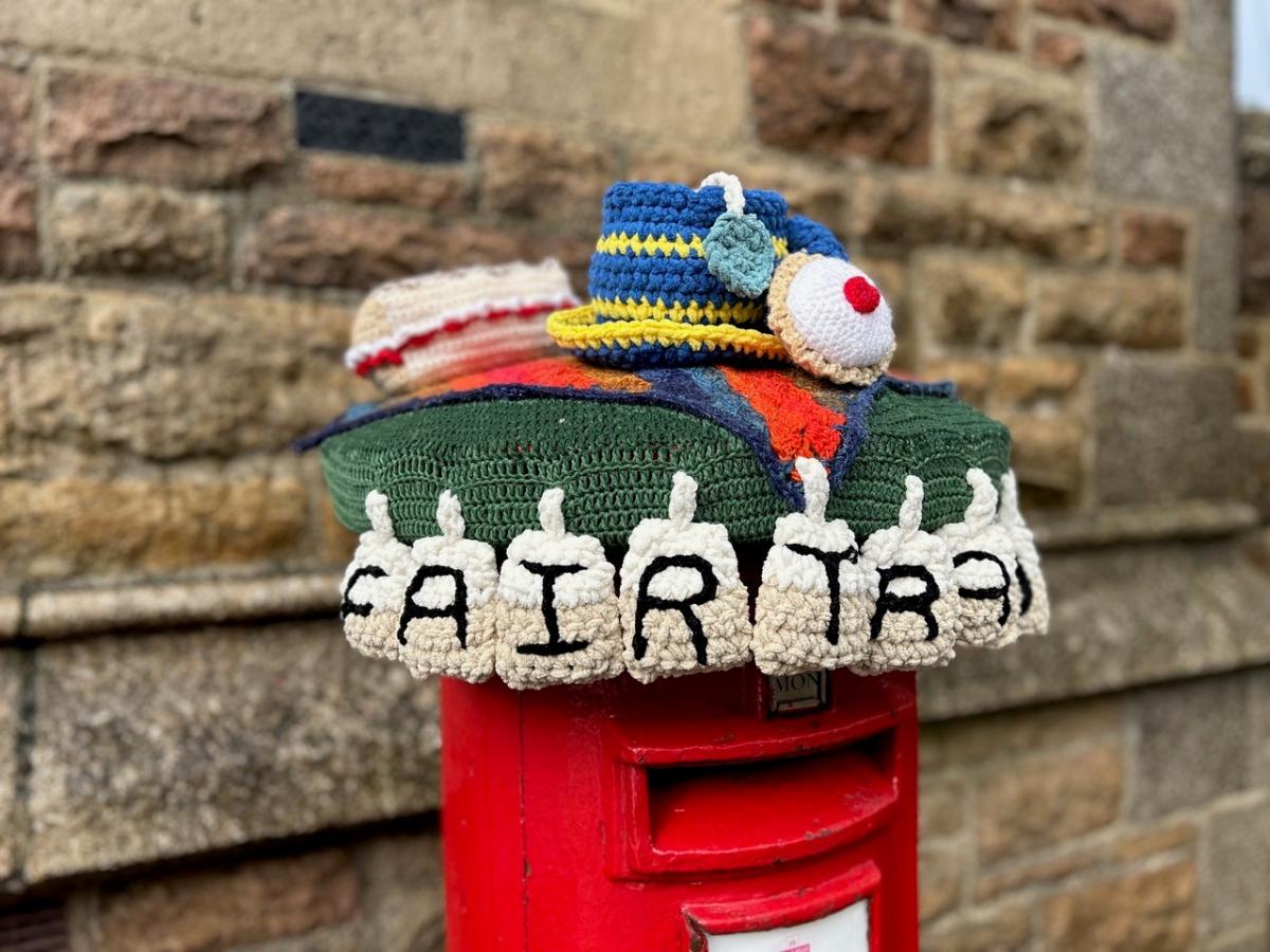
It was unexpected, personal and unmistakably human. Instead of a corporate message, shoppers saw something created by real people who cared. That simplicity made the campaign memorable and reminded consumers that Fairtrade isn’t just a logo, it represents livelihoods and real stories behind the products they buy. And it echoes what we’ve seen in our own work: when the story resonates, the symbol becomes support, not the main event.
Make it obvious. Make it emotional. Make it stick.
Tick-Box Seals vs Trust Signals
Some industry leaders point out that certifications risk becoming:
- “tick-box exercises”
- “entry-level compliance”
- “greenwashing with better art direction”
Some NGOs (Non-Governmental Organisations) argue that certifications can mask deeper issues, especially when companies promote eco-labels but resist stricter sustainability rules.
And in many cases, smallholder farmers, the very people these seals are meant to help, can’t afford to participate. Because certification also carries financial costs, from audit fees to compliance checks and royalties, which can make participation even more challenging for smaller producers.
Retailer pricing pressures also play a role, often limiting the financial room available to improve wages and conditions for producers. So, while seals multiply, trust doesn’t always.
This is where design earns its place.
Because design isn’t there to decorate the message.
Communication isn’t what you say. It’s what people understand.
Red Tractor: The Logo That Outran Its Own Story
The Red Tractor logo used to be the safe, friendly little badge that told you: Relax, this food’s been grown properly. But scratch the surface and the shine’s come off.
The ASA called them out this year for overselling their environmental standards, which is a polite way of saying the ad didn’t match reality. Meanwhile, data from the Environment Agency showed that a large chunk of serious pollution incidents involved Red Tractor farms.
Add in thousands of breaches logged by inspectors, and even Red Tractor themselves now admit the environmental bit of their scheme isn’t what many people think it is.
In simple terms: the promise got bigger than the product. When a label tells a story it can’t back up, trust goes out the window.
Other Badges: When A Logo Does More Talking Than The Farm
And Red Tractor isn’t alone.
Other schemes have been wobbling on their pedestals too.
RSPCA Assured has been caught out after undercover footage revealed less-than-reassuring welfare on some approved farms, not exactly the cosy image the logo suggests.
Soil Association Organic, the heavyweight in this space, still takes heat for certifying massive operations that don’t look much like the “small ethical farm” in consumers’ heads.
Then there are the supermarket-grown badges- M&S Select Farms, Tesco’s Sustainable Farming Group, and the vague “Farm Assured”. Big on promises. Light on transparency.
The pattern’s the same: the marketing team builds a story, and the farm doesn’t always live up to it. When that gap gets too wide, the badge stops reassuring and starts raising eyebrows.
The Challenge for 2026: Clarity Beats Clutter
Consumers want sustainable products. They want reassurance. But they don’t want packaging that feels like an ecological stamp collection. We’ve watched packaging panels swell over the years, from three or four key elements to dozens of competing claims. Without a disciplined hierarchy and narrative structure, even the strongest sustainability effort struggles to be seen.
At P&W, we help brands evolve from “more badges” to “better stories”:
✔ Make hierarchy ruthless
If everything’s important, nothing is.
✔ Turn complexity into plain English
If a seal represents soil regeneration, say what that means.
✔ Build message layers
Front-of-pack is the hook.
Back-of-pack is the context.
Digital is the deep dive.
✔ Stay human
A farmer’s story beats a certification policy.
✔ Use symbols as proof, not personality
Certifications shouldn’t be the hero. The brand should.
The Frog Isn’t the Story. It’s a Supporting Character.
The Rainforest Alliance frog is a well-recognised and trusted symbol, built up over more than three decades. But the new regenerative seal won’t automatically inherit that recognition. It will need clear explanation, considered context and thoughtful integration into packaging and brand narratives.
That means reconsidering not just where the seal sits, but how it works with colour, layout, tone of voice and the brand’s wider sustainability architecture, the practical realities we navigate every day in pack design.
Without that, it risks becoming just another green icon competing for attention.
Ultimately: “Don’t rely on the symbol to do the job your brand should be doing.”
Our View
Sustainability is shifting from a marketing claim to a design discipline in its own right.
Rainforest Alliance’s new seal is a strong step forward for farmers and ecosystems.
but its success on shelf depends entirely on how brands present it.
Having designed packs since 1987, we’ve seen how easily meaning is diluted when visual systems become crowded or inconsistent. The brands that win are those that treat sustainability as part of their design DNA, not an add-on.
A badge doesn’t build trust.
A clear, honest, well-designed story does.
The frog may be returning, but if brands want consumers to leap with it, they’ll have to make the message land.