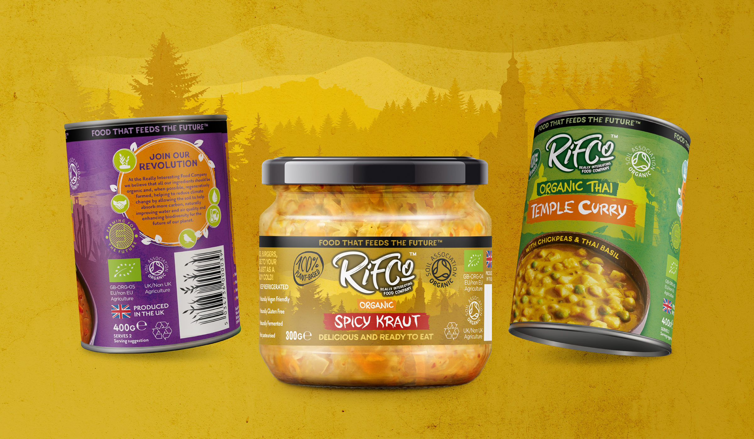
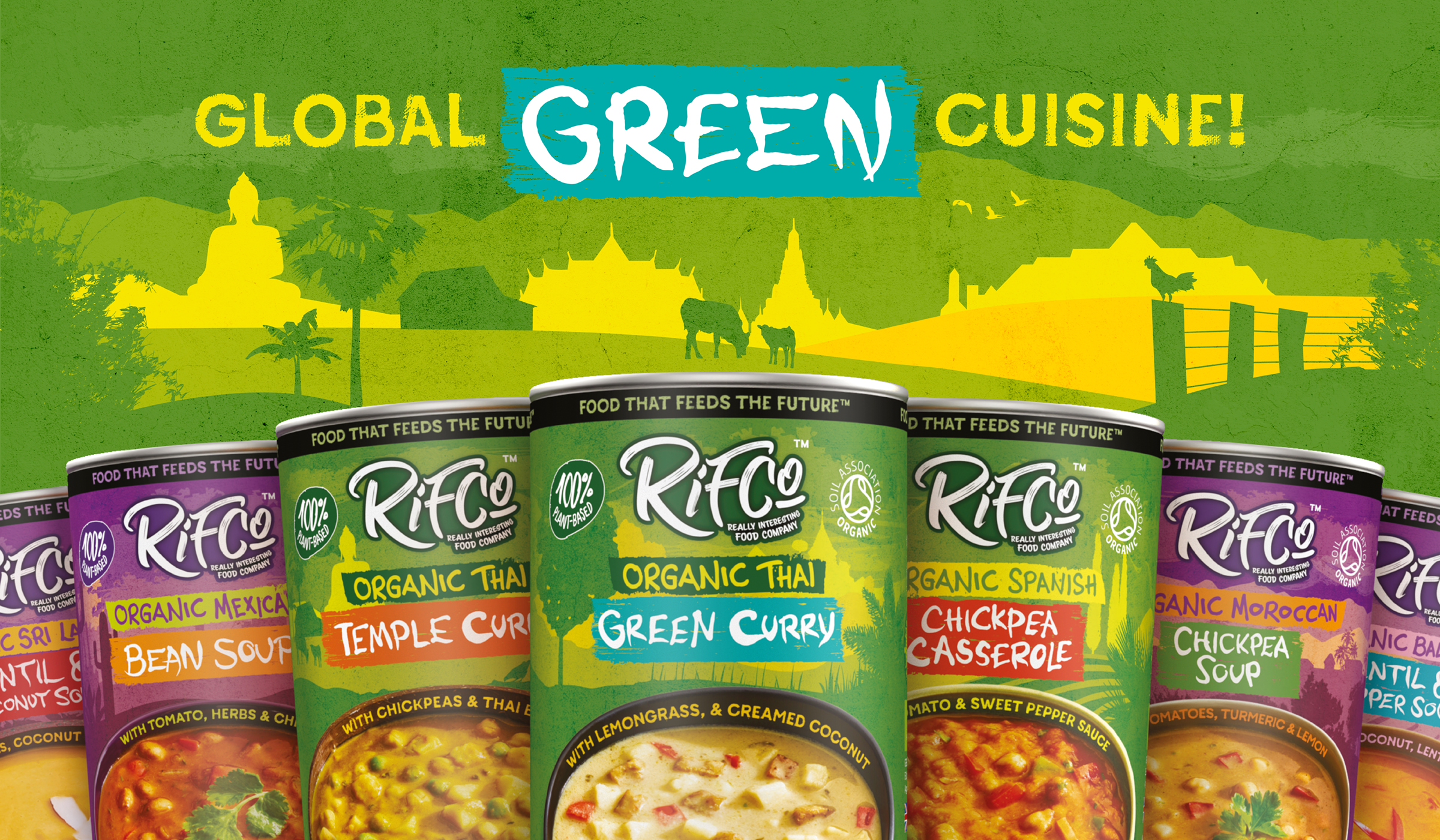
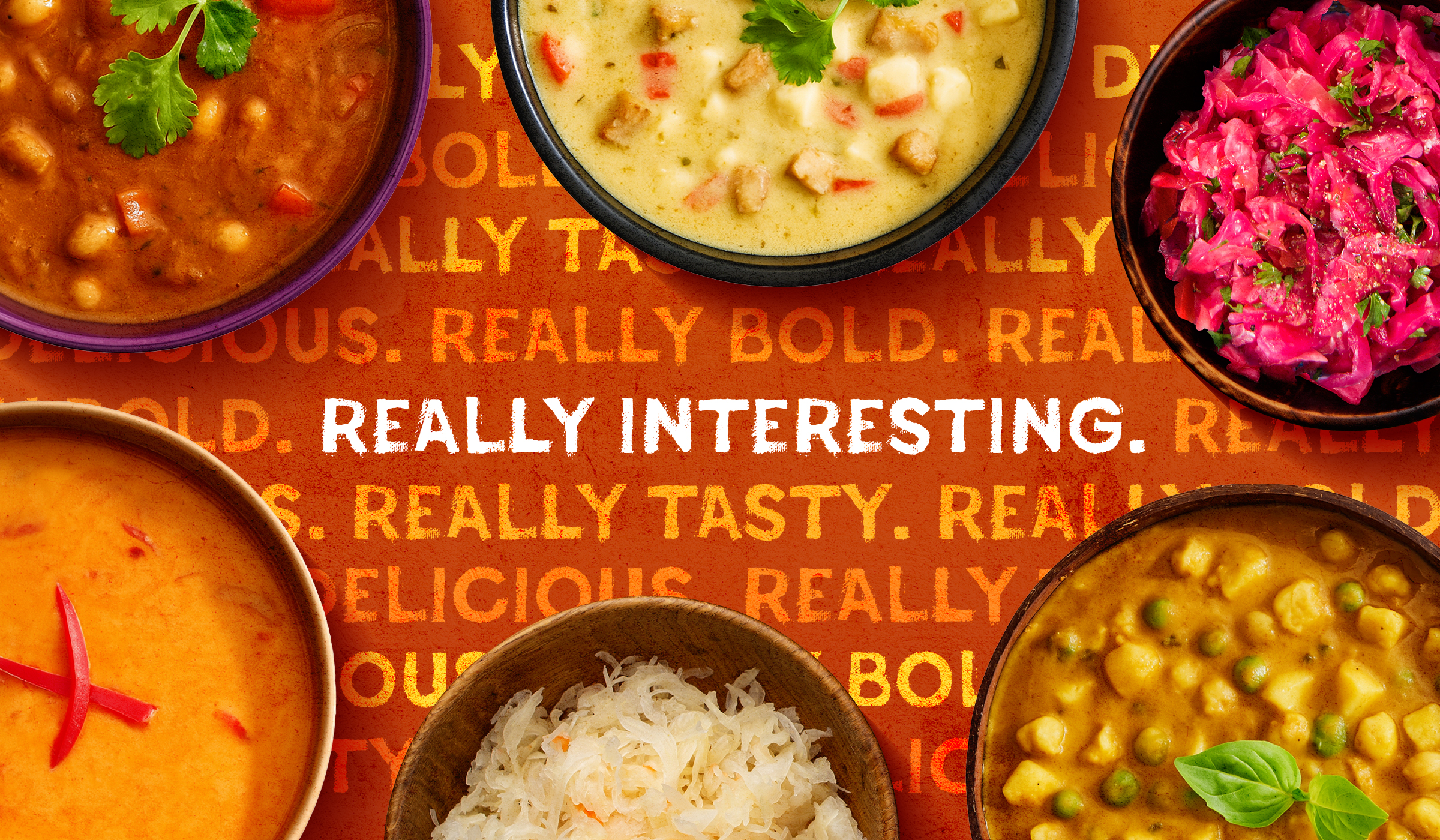
A bold, design-led reinvention for RIFCo’s organic, plant-based range, spanning fermented jars as well as canned soups and ready meals. The striking new identity repositions the brand to captivate a younger, eco-conscious audience seeking fast, flavourful, future-friendly food.
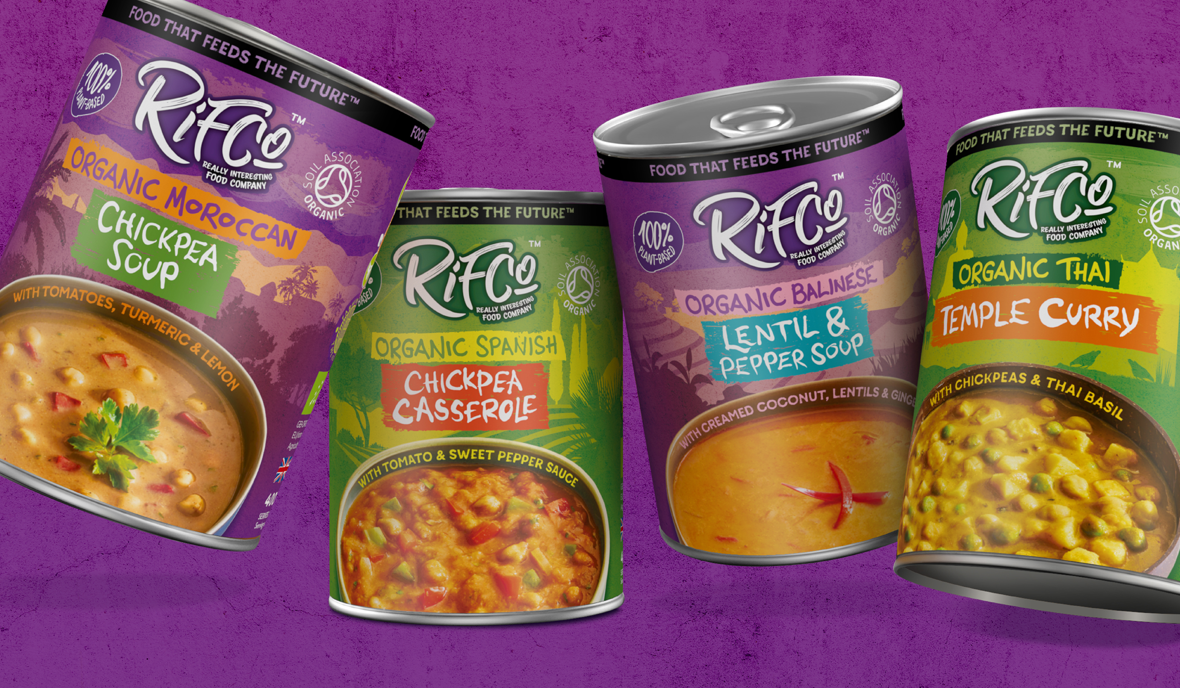
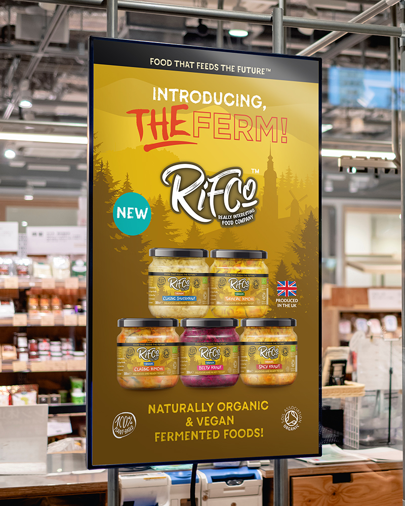
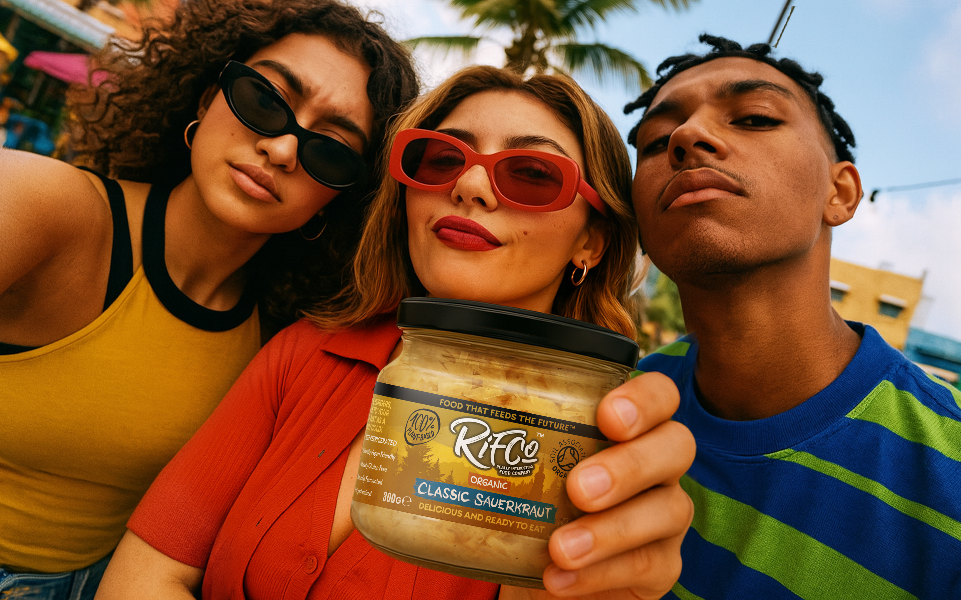
P&W was appointed to reposition RIFCo as a vibrant, progressive brand that resonates with Gen Z consumers while retaining the integrity of its organic, planet-first ethos. Managing Director Cliff Moss felt the brand was due a strategic and visual overhaul to meet the expectations of modern shoppers who value both convenience and conscious choices. The growing RIFCo range, now comprising five jarred fermented products, four canned soups, and three canned ready meals, showcases the brand’s deep-rooted commitment to sustainable, plant-based nutrition.
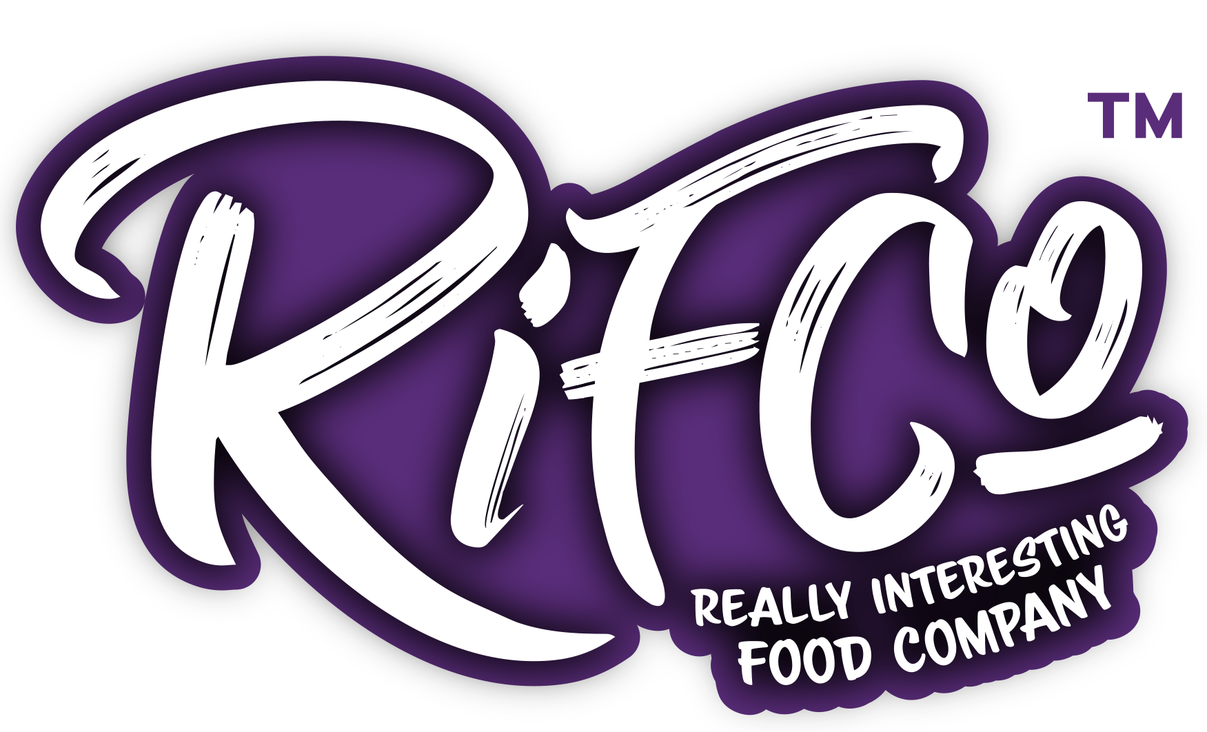
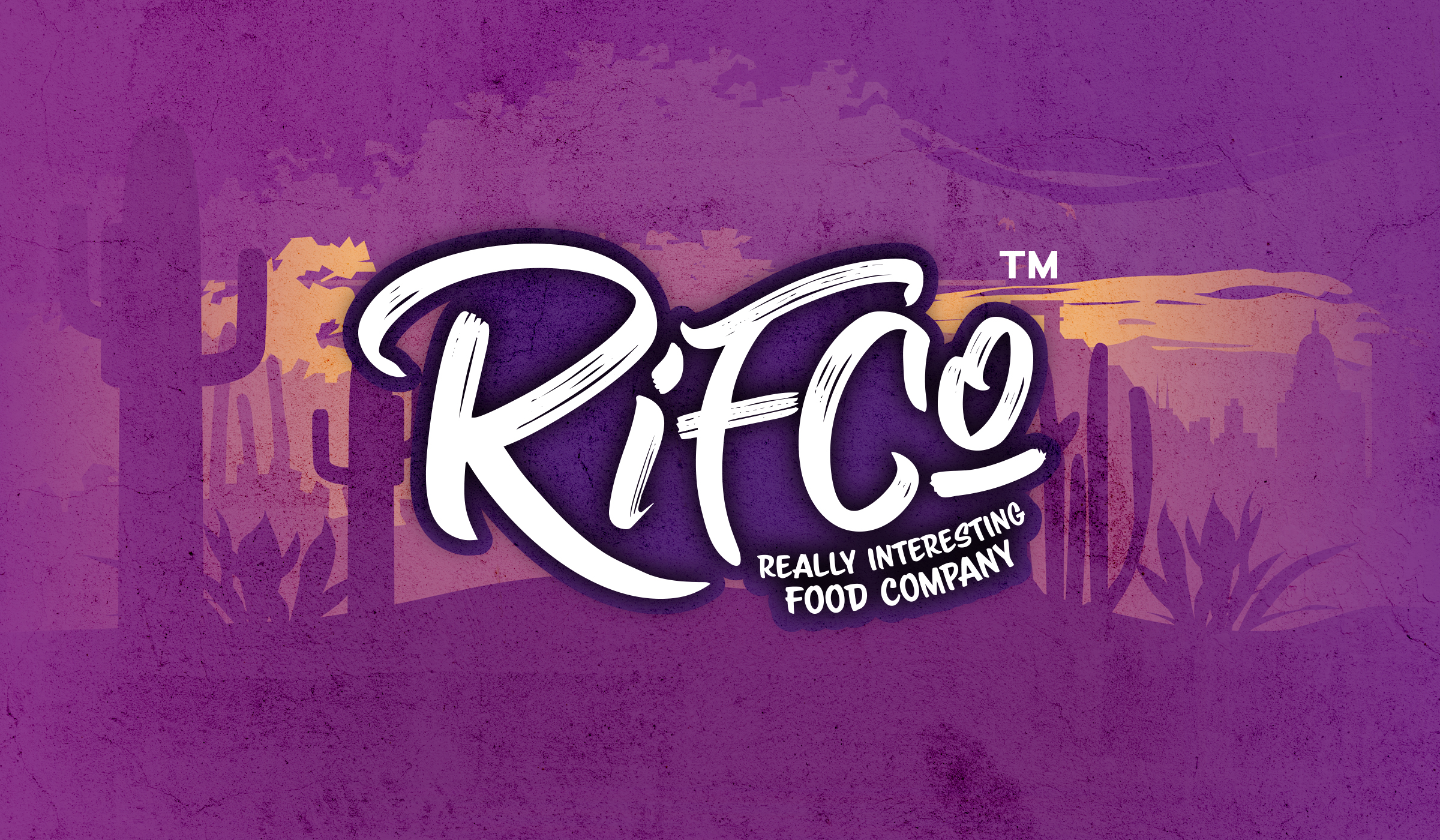
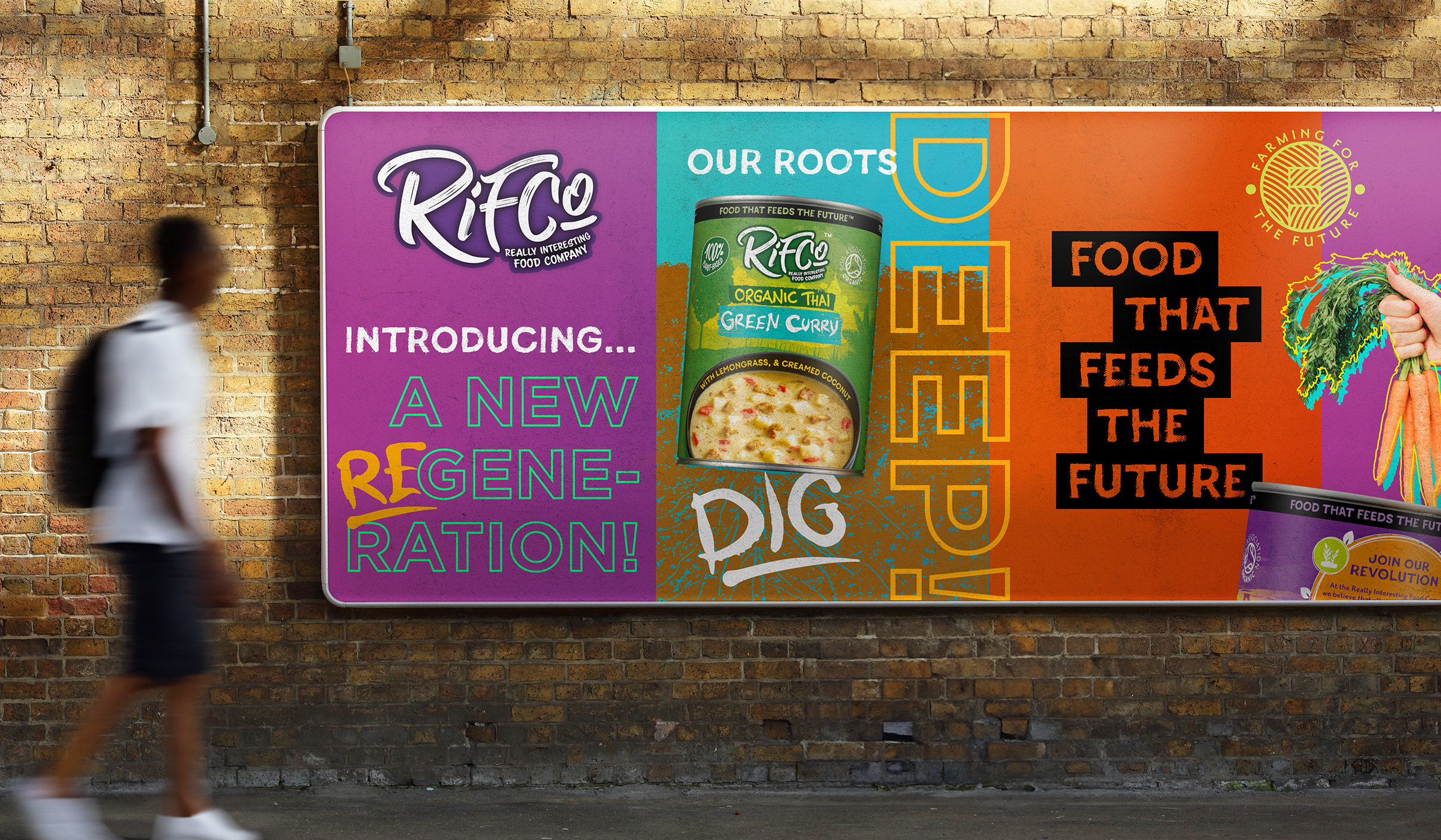
Layered graphic illustrations of global landscapes form the backdrop of each pack, evoking provenance, flavour and freshness in an ownable, contemporary way. P&W crafted a bold new RIFCo wordmark, designed bespoke barcodes inspired by crop rows, and introduced a ‘Farming for the Future’ marque to sit proudly on the back of every pack. The result is a visually rich identity that commands attention on shelf, particularly among a younger demographic. Whether stocked alongside heritage soup brands or in modern health food aisles, RIFCo now radiates energy, relevance and purpose.
Now available via Ocado and several leading online health and wellness retailers, RIFCo is rapidly gaining traction with a conscious consumer base. It’s expected to resonate especially with the 25.9% of Gen Z and 15.5% of Millennials committed to a meat-free lifestyle. Yet, with 7.2 million UK adults identifying as vegetarian or vegan, the brand’s appeal extends far beyond its core demographic, offering mainstream potential for a new era of sustainable eating.


“P&W’s redesign has brought RIFCo into the 21st century. I’m confident the striking modernisation will provide us the stand-out required to boost sales significantly and gain listings in the major multiples. It’s rewarding to have an alignment between our brand values and our aesthetic.”